×
Menu
Index

Responsive Web Design

Responsive Web Design
1

Tablet Layout...

1. Tablet Layout...
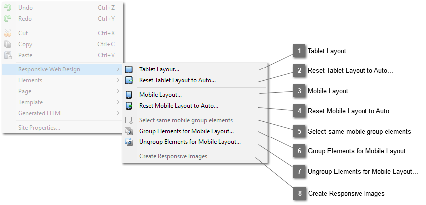
Open the Tablet Layout Properties Dialog applicable to the selected element to set options governing the layout of the page when the device width or browser window width is within the tablet breakpoints.
2

Reset Tablet Layout to Auto...

2. Reset Tablet Layout to Auto...
Set the layout option on the Tablet Layout Properties Dialog to "auto".
3

Mobile Layout...

3. Mobile Layout...
Open the Mobile Layout Properties Dialog applicable to the selected element to set options governing the layout of the page when the device width or browser window width is within the mobile breakpoints.
4

Reset Mobile Layout to Auto...

4. Reset Mobile Layout to Auto...
Set the layout option on the Mobile Layout Properties Dialog to "auto".
5

Select same mobile group elements

5. Select same mobile group elements
If the selected element is inside a mobile layout group, clicking this button will select other elements that are within the same group.
6

Group Elements for Mobile Layout...

6. Group Elements for Mobile Layout...
Add all selected elements to a mobile layout group.
7

Ungroup Elements for Mobile Layout...

7. Ungroup Elements for Mobile Layout...
Remove the selected elements from the mobile layout group.
8

Create Responsive Images

8. Create Responsive Images
Create responsive images from the selected image using the preference settings from Responsive Web Design Preference.