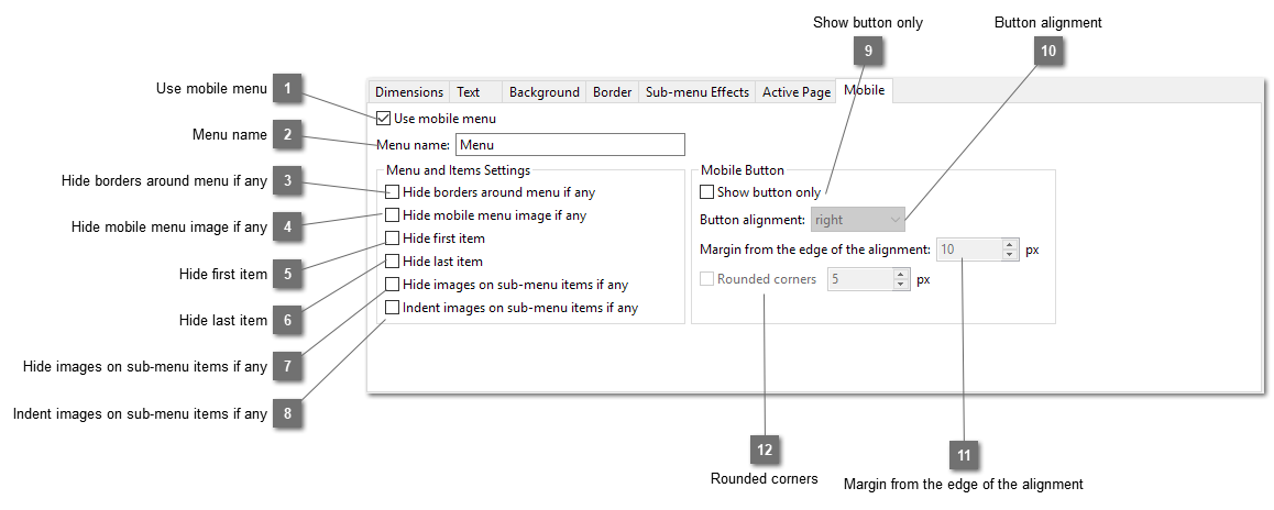
Some navigation bars use images on the main items. They work well in desktop and tablet layout but not mobile. Select this option will hide these images in mobile menu. For example, the following works on desktop and tablet but not mobile.
As sub-menu styles are used for mobile menu even for the main items, select this option will fix the problem.
For some navigation bars, the first item is not used for showing any menu items, it is just used for placing decoration like the example below. However this item is unnecessary and may break the mobile menu in mobile layout. So select this option will hide the first item in mobile menu.
For some navigation bars, the last item is not used for showing any menu items, it is just used for placing decoration like the one above. However this item is unnecessary and may break the mobile menu in mobile layout. So select this option will hide the last item in mobile menu.
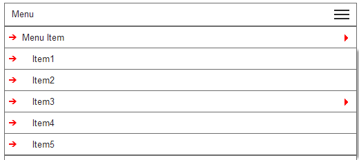
Some navigation bars may use images on the sub-menu. They may not be needed for mobile-menu. Select this option will hide them. Like the following example:
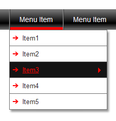
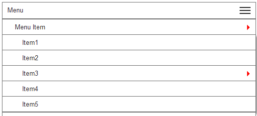
After selecting the option, the mobile menu will looks like below:
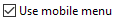
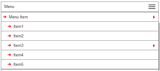
Rather than using "Hide images on sub-menu items if any". You can retain the images but you can indent them according to the levels of the menu items. Select this option instead of the above will show the following result:


 to this one
  .
.