As the width of the page is 900 pixels and we use the default mobile breakpoint at 768 pixels, so the tablet layout will be used when the width of the browser window is between 769 and 900 pixels.
The layout strategy for tablet is to keep all elements as they are on the desktop view, reducing the width of each element to fit the width of the browser window proportionally. When decreasing the width, the height of some elements will be expanded like the text elements and the others are decreased in aspect ratio like the image elements. Their position will be adjusted accordingly.
Each element has a default layout approach assigned. You can use the Responsive Design view of the internal browser or the external browsers with this tool such as Firefox and Google Chrome to check out the default layout of the elements by adjusting the width of the browser window from 900 to 769 pixels. Some elements will work and some will not. For those that do not work, manually select the rules the are appropriate. Sometimes you may need to adjust the size of the elements especially the text element in order to make them work. Sometimes , you just need to turn off the "Auto" layout and the elements will work especially for small image elements on a page.
The following shows how we go over each element on pages after checking them in the Responsive Design View. After setting each element, you can refresh the Responsive Design View to see if the new settings work by pressing the key "F5" if you are using the external browsers for previewing.
Open the template page "template.html".
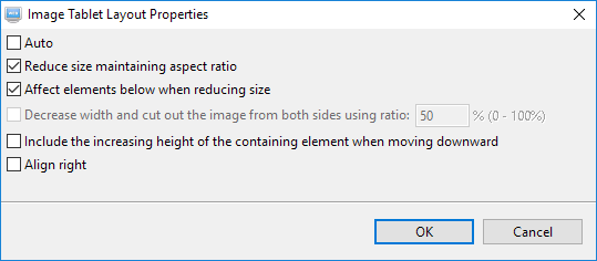
The logo on the top left corner does not need to be reduced in size so we turn off the "Auto" setting as it will decrease it in aspect ratio as it is the default with that image size. Select the logo and then click on this button on the toolbar. Then deselect the option "Auto". The default selected options will be shown. Deselect them all like the following. Click on the OK button to save the settings. For a more detail description of each option, press the "F1" key when the "Image Tablet Layout Properties" dialog is opened.
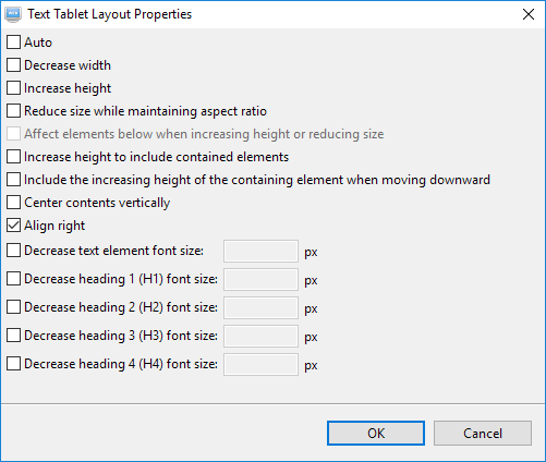
Select the text element on the top right corner. Click on the tablet layout button as above. We do not need to decrease the width or increase the height of this element as there are enough spaces around it. We just need to align it to the right. So deselect the "Auto" option and any others thereafter. Then select only the option "Align right". Click on the OK button to save the setting.
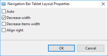
There are enough spaces after the items of the navigation bar. So we only need to decrease it to fit the width and no need to decrease each item. Click on this button . Deselect the "Auto" option and select only the "Decrease width" option.
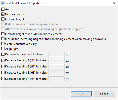
Select the copyright text element at the bottom of the page. No need to increase its height as the text is short. Click on this button . Deselect "Auto". Select "Decrease width" only.
Open the page "index.html".
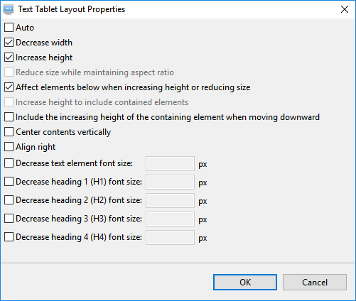
Select the following image on the page. Click on this button . Deselect "Auto". As there are no other elements placed over the image, select "Reduce size maintaining aspect ratio" and "Affect elements below....". If you want to keep the height of the image, you can select "Decrease width and cut out image...." instead.
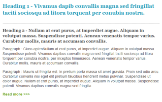
Select the following text element on the page and then click on this button .
Deselect the option "Auto" from the following dialog shows that the default options are "Decrease width", "Increase height" and "Affects elements below...". The default is what we need. So we just select the option "Auto" again.
All other elements on the page are text element and the default option as mentioned above also work for them so we do not need to set anything and just use the default.

 does not need to be reduced in size so we turn off the "Auto" setting as it will decrease it in aspect ratio as it is the default with that image size. Select the logo and then click on this button
  on the toolbar. Then deselect the option "Auto". The default selected options will be shown. Deselect them all like the following. Click on the OK button to save the settings. For a more detail description of each option, press the "F1" key when the "Image Tablet Layout Properties" dialog is opened.
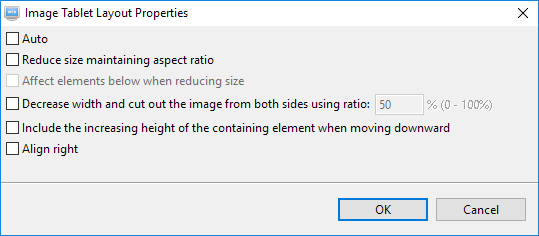
 on the top right corner. Click on the tablet layout button