We use the default breakpoint 768 pixels to trigger the mobile layout. When the width of the browser window is 768 or below, the mobile layout will be used.
The main layout strategy is to arrange each element on the page one after another in a single column. The order is determined by the position from the top and then position from the left if elements have the same position from the top.
Empty text elements are hidden in mobile layout by default as they are usually used as background for another elements on top of them in desktop and tablet layouts.
Open or switch to the template page "template.html".
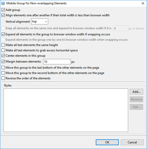
Select the image on the page. Click on this button and deselect the option "Auto" as shown below. The default has a bottom margin of 20 px. We do not need this for this element. Deselct this option and click on the OK button to save the setting. For a more detail description of each option, press the "F1" key when the "Image Mobile Layout Properties" dialog is opened.
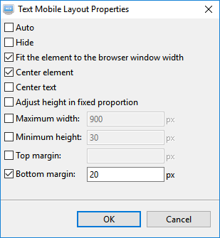
Select the text element and click on the button . Deselect the option "Auto". There are other options selected by default. For this element, we only need to keep the one that fits the element to the width of the browser window as shown below:
For the navigation bar, we will just let the option "Auto" selected as the other options are not selected by default.
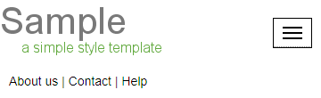
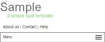
After the above the mobile layout for the header will looks like below
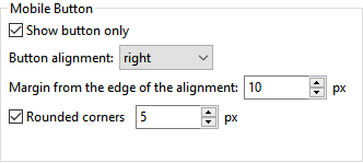
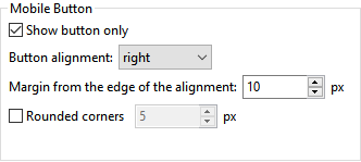
There is an alternative style which shows the navigation bar as a button on the top right corner. To use this style, double-click on the navigation bar to open it in the Navigation Bar Editor. Click on the "Style" tab and then the "Mobile" tab. Select the option "Show button only". Click on the OK button to save the setting.
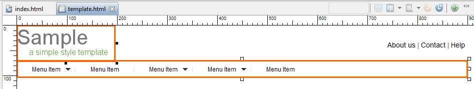
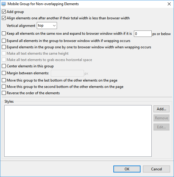
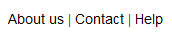
As elements are placed on a page according to their position from the top and then from the left, so we need to group the navigation bar with the logo on the top left corner so that they will be handled liked a single element. Select both elements and then click on the mobile grouping button . Set the options as shown below and click on the OK button to save the setting:
Now the header will looks like below.
If you want the button to have a rounded corner, you can select the option in the Navigation Bar Editor as shown below:
It will now looks like this.
Now, click on the copyright text element at the bottom of the page and then click on this button . After deselecting the option "Auto", it shows the default selected options. The default works for us, so we leave it as is and select the "Auto" option again or just click the OK button to accept the settings.
Open the index page "index.html".
Select the image below on the page and click on this button . Deselecting the option "Auto" shows that the default selected options will reduce the size of the image in aspect ratio and leave a margin of 20 pixels below. The default works for us so we can cancel the dialog to let it use "Auto".
Select the following text element on the page and click on this button . Deselecting the "Auto" option shows several default selected options which work for us. So cancel the dialog and just use the default.
For the other text elements on the page, the default options also work so we do not need to set anything and let them use the "Auto" option.
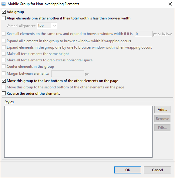
There are two text elements on the right side of the page as shown below. Owing to the position of the first element, it will goes below the element at point 10. However we want them to be at the bottom. To do this, select them both and click on this button . We add them both to a mobile group and move the group to the bottom of the page.
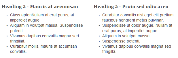
The two text elements shown below are expanded to the width of the browser window when the mobile layout is triggered at 768 pixels. Each occupies a single row. We can keep them side by side and let them expand only when the width of the browser window cannot accommodate both of them on the same row. To do this, select both of them and click on this button . Select the options as shown on the dialog below. We also add spaces between them by setting a margin of 10 pixels.
Now you can test out the results in the internal browsers, the developer tools in Firefox and Google Chrome and also on the physical devices.

 on the page. Click on this button
  and deselect the option "Auto" as shown below. The default has a bottom margin of 20 px. We do not need this for this element. Deselct this option and click on the OK button to save the setting. For a more detail description of each option, press the "F1" key when the "Image Mobile Layout Properties" dialog is opened.
 and click on the button
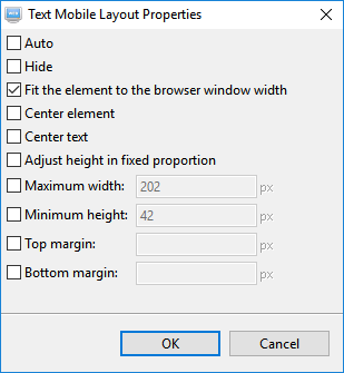
 . Set the options as shown below and click on the OK button to save the setting: