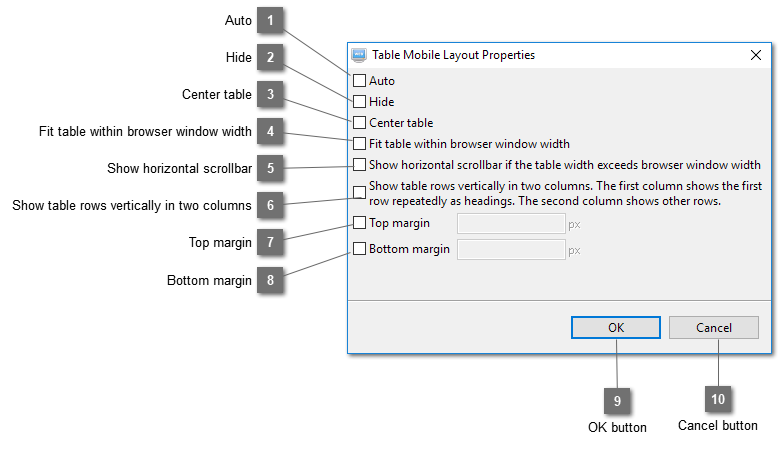
Select this option to let the program determine automatically what layout strategies to use. Owing to the dynamic nature of a web page. It is most likely that the strategies determined are not appropriate. Deselect this option will show what options have been determined automatically without considering its relationship with the surrounding elements. You can then customize your settings.
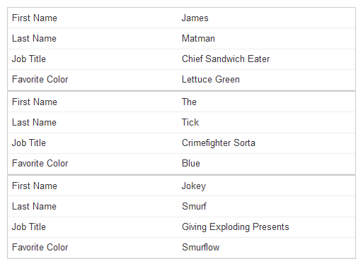
Show table rows vertically in two columns when layout the table in mobile. The first column will show the first row repeatedly as headings and the second column will show each row vertically.
