Responsive images of an image are different sizes of the same image. Browsers will choose which one to load according to the width of the browser window.
For example, the original size of the example image is size 900x330. Browser will load it if the width of the browser window is over 768. When the width is between 768 and over 480, the one with width 768 will be loaded, etc.
The purpose is to serve smaller size images rather than to resize the original image which is larger in size to fit the width. Images of smaller size will be loaded faster.
Responsive images are supported in images on a page and also background images set in the CSS Style Editor. We will use an image on the website created from the Getting Started Tutorial as an example. The same website can also be created from the template "Sample Template".
Open the page "index.html".
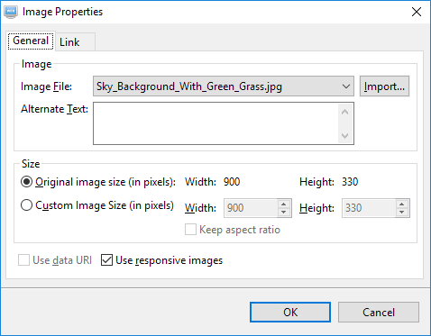
Double-click on the image below on the page to open it in the Image Properties Editor.
Select the option "Use responsive images" and click on the OK button.
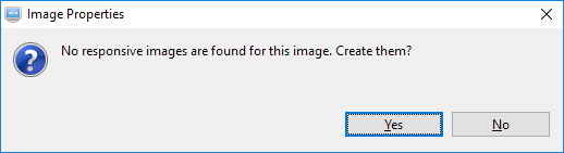
If no responsive images are found, you will see the following dialog. Click on the "Yes" button to generate them.
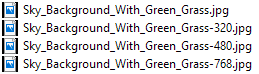
Three more images with width 768, 480 and 320 will be generated from the selected image.
If you make changes to the image "Sky_Background_With_Green_Grass.jpg", you will need to generate the corresponding responsive images again. Right-click on the file "Sky_Background_With_Green_Grass.jpg" and select "Create Responsive Images" from the context menu.