Step 4: Make pages look good on tablet and mobile devices using Responsive Web Design
Make pages look good on tablet and mobile devices in addition to desktop. Tablet layout will be used if the width of the browser window is less than the width of the page. When the width of the browser window reaches 768 (the default mobile breakpoint), mobile layout will be used. Using the width of this website (900 pixels) as example, when the width of the browser window is over 900 pixels, the page will be shown as is. When the width is between 769 and 900 pixels, the tablet layout will be used. When the width is 768 pixels or below, the mobile layout will be used. The lowest width targeted for mobile is 320 pixels.
You can test the page in different widths using browsers installed on your computer. The internal browser which is Internet Explorer 11 can be used to check out the page quickly. When viewing your page on an external browser, be sure to press F5 to refresh the page if you have made changes to it in the program.
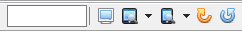
To test your pages in the internal browser, use the toolbar on the top right corner of the preview tab . Several common sizes are already defined. You can add your own tablet and mobile device sizes by selecting "Tools" >"Preferences" from the main menu. Then select the item "Browser Preview".
For external browsers, you can use the Responsive Design Mode in Firefox by pressing <Ctrl+Shift + M> and Developer tools in Google Chrome by pressing <F12> and then <Ctrl+Shift + M>.
Step 4: Make pages look good on tablet and mobile devices using Responsive Web Design

 . Several common sizes are already defined. You can add your own tablet and mobile device sizes by selecting "Tools" >"Preferences" from the main menu. Then select the item "Browser Preview".